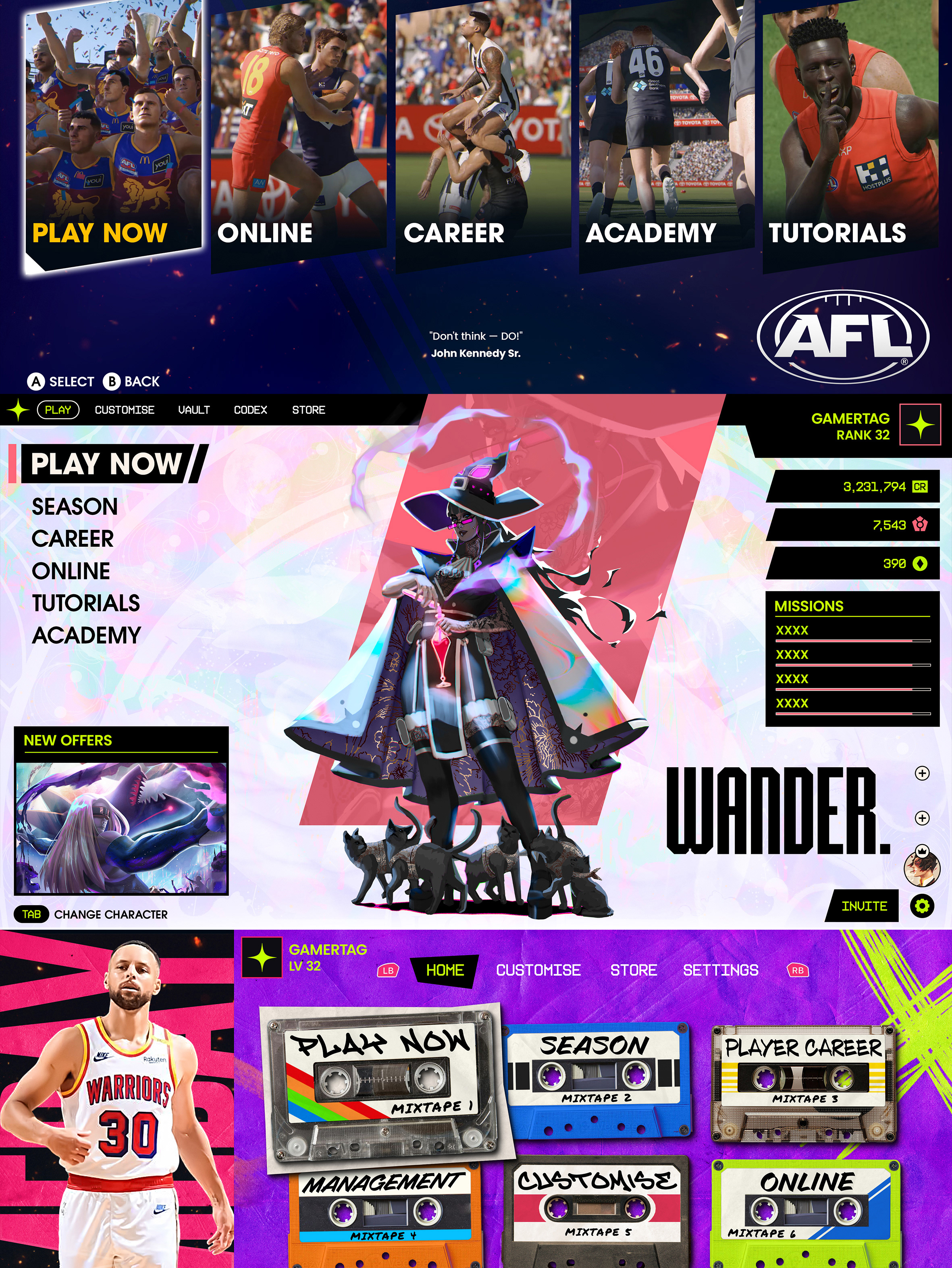
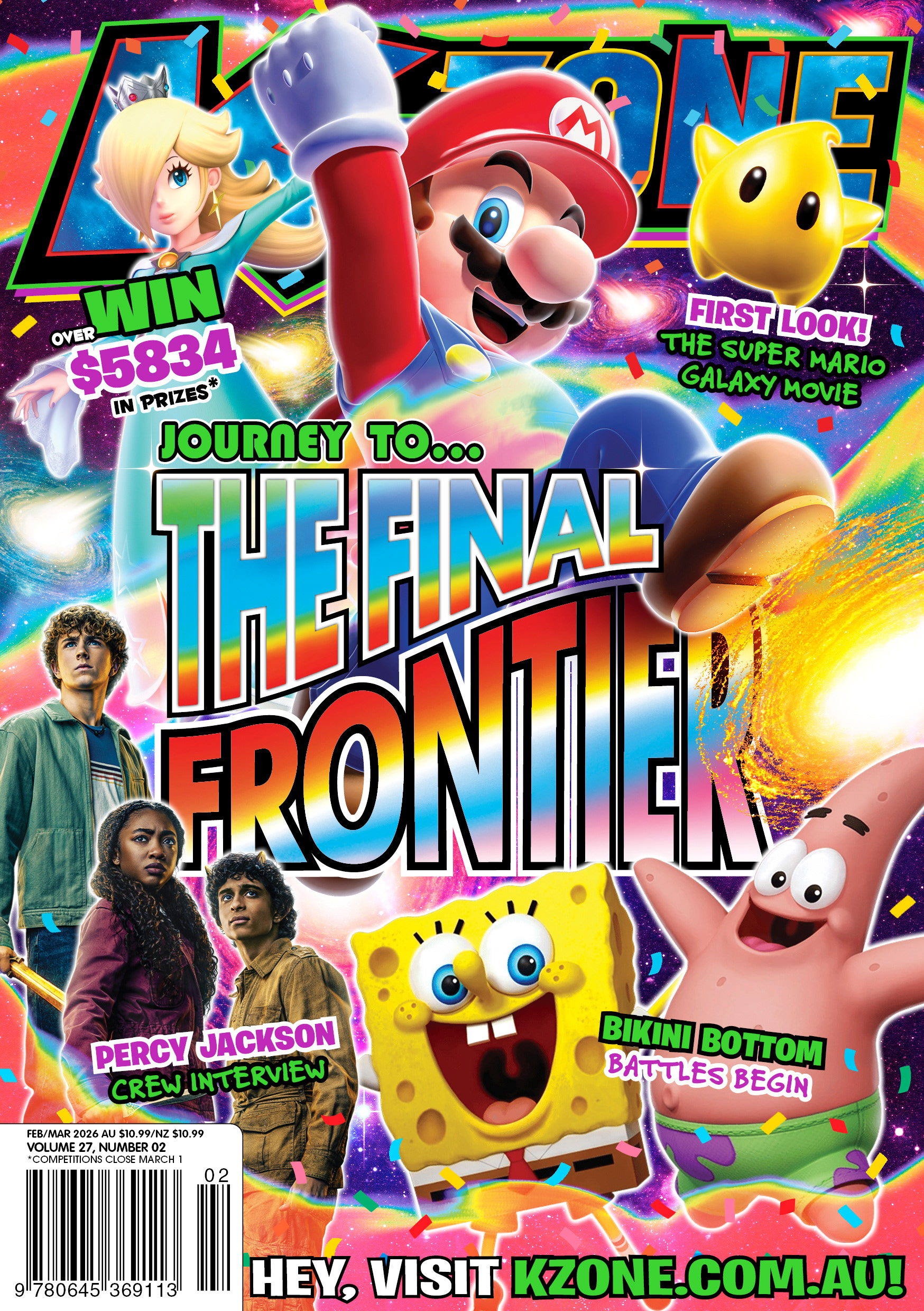
Cover created for the 'Feb/Mar' issue of K-Zone. The final K-Zone magazine published under Nextmedia.
As the final K-Zone issue published under Nextmedia, this was a momentous occasion to really capture the incredible run K-Zone has had throughout the years. I anchored the entire concept around three core pillars: FUN, COLOUR, and ADVENTURE.
These elements have always defined what K-Zone represents, and I wanted the last issue to fully embody that spirit, something bold, imaginative, and truly worthy of a finale. By leaning into the strong (and perfectly fitting) theming of the main coverline, my goal was to create something phantasmagorical and energetic, the kind of cover that instantly feels like a send-off.
FUN
K-Zone has always been about sparking joy, capturing imaginations and celebrating playfulness. To bring that feeling to life, I built the cover around a sweeping magical ribbon of energy that moves through the entire composition.
It begins behind the masthead, curves down across Mario, then twists again to wrap the lower portion of the page. This swirling motion adds dynamic flow and depth, pushing elements in front of and behind the effect so the whole layout feels alive and layered.
Even the main coverline has a gentle bend, reinforcing that sense of movement and helping the design feel more immersive.
COLOUR
For colour, the vision was simple: a vibrant explosion.
To achieve that, I deliberately reduced the overall Pantone coverage so the full CMYK range could shine at maximum intensity. Gradients can easily look cheesy if not handled carefully, so I intentionally crafted smooth, vibrant transitions that remain harmonious and balanced across the design.
The magical element features a kaleidoscopic rainbow effect; a visual nod to imagination, creativity, and the colourful legacy of K-Zone itself.
For Pantones, I’ve used:
- Classic fluro green - a nostalgic, iconic K-Zone staple
- Purple - its complementary colour, creating striking contrast
- Classic fluro green - a nostalgic, iconic K-Zone staple
- Purple - its complementary colour, creating striking contrast
ADVENTURE
To capture that sense of journey and transition, Mario physically steps over the main coverline; symbolically moving from one place to another.
To deepen this theme, I added a series of small “galaxies” beneath him, acting like a trail of stepping stones across space. Each one represents a previous K-Zone issue, a constellation of adventures the magazine has taken readers on over the years.
The nearest galaxy on the right shows where Mario is headed next. The galaxy partly hidden behind the main coverline (by Mario's other foot) shows where he has launched from. Further back, smaller galaxies fade into the background, representing the long history that led to this moment.
Only the final galaxy cuts off at the page edge, a subtle symbol that while K-Zone’s adventure continues, our chapter in it concludes here. The rest of the journey will unfold “off-screen.”
FINAL NOTE
I wanted this final cover to be something truly special, a last opportunity to showcase what this team is capable of and the immense creativity, skill, and passion that has been poured into this magazine.
There has never been a K-Zone cover quite like this one. Yet, it embodies the essence of K-Zone's spirit.
And honestly, I think that’s exactly how it should be.
And honestly, I think that’s exactly how it should be.