My main focus for this redesign project was to tap into the energy, tone, and sense of fun that came through so strongly in the mood board provided by the editor. This felt especially important given the primary feedback about the previous layout was that it didn’t quite capture readers’ attention or invite them to explore further. So the challenge became: how do we make this page feel like a discovery zone, not just an info corner?
Header Redesign
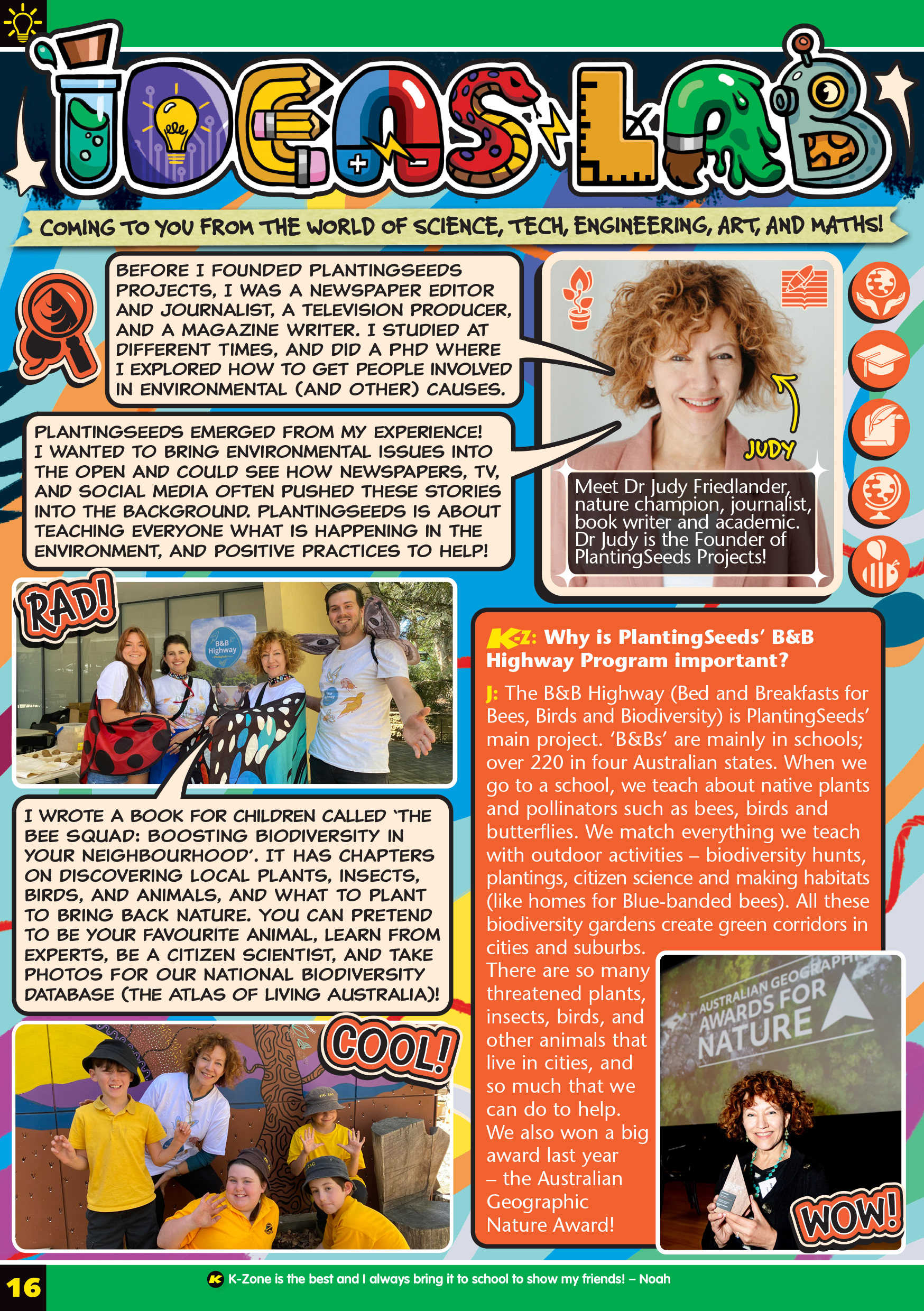
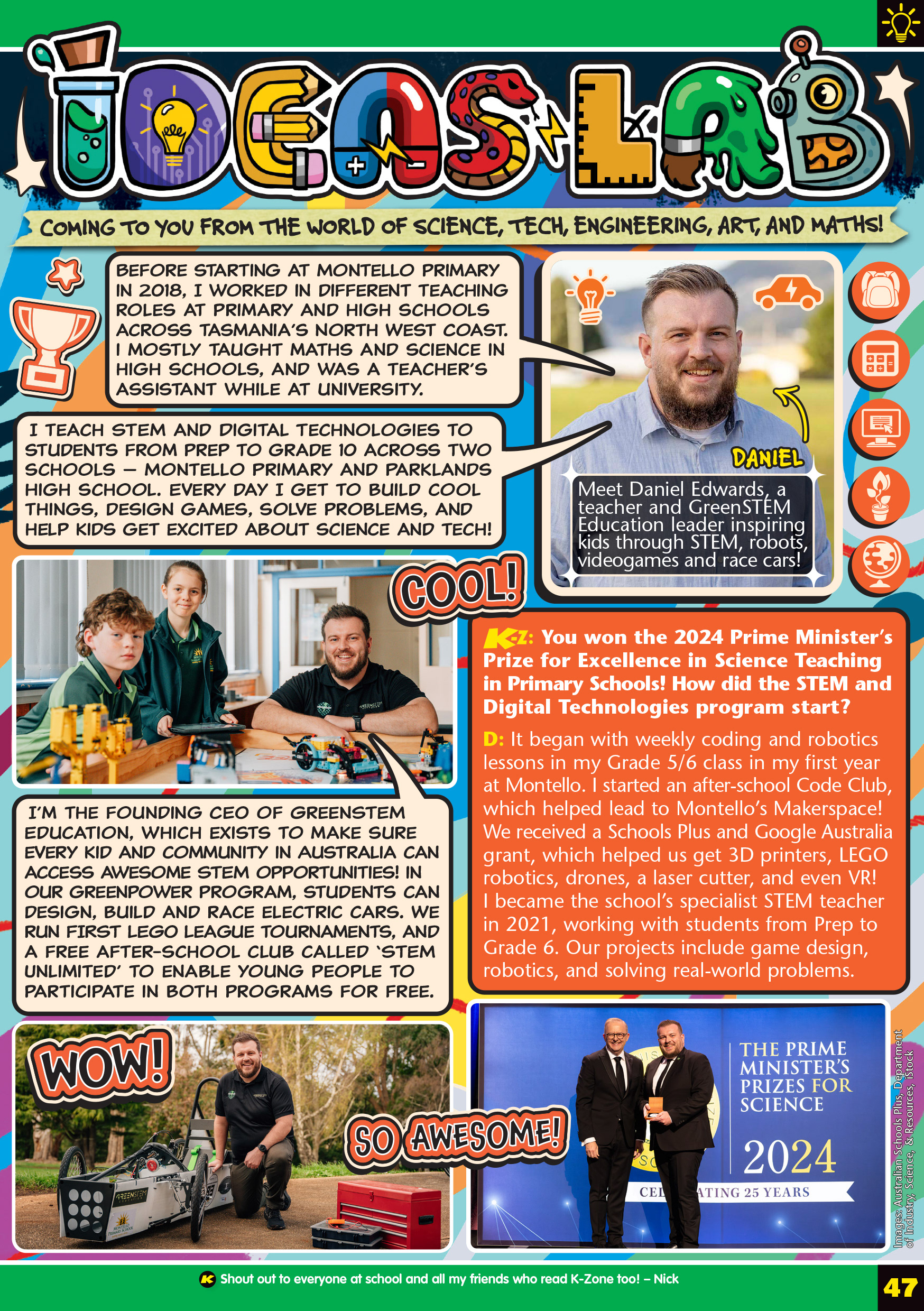
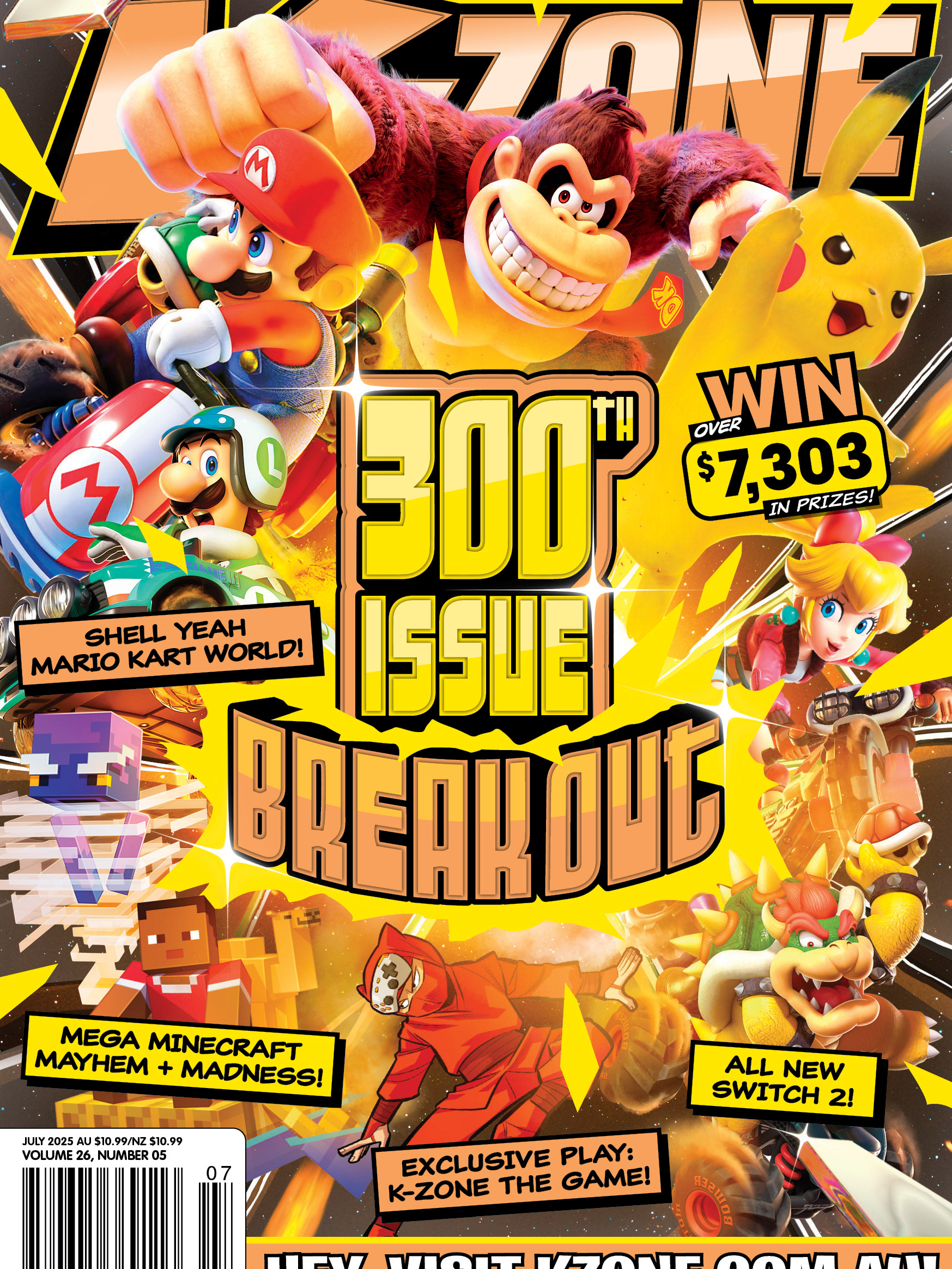
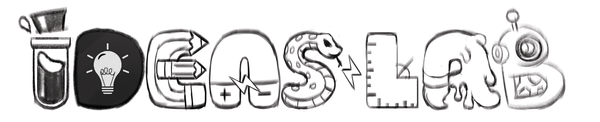
The first piece I tackled was the header, since it really sets the tone for the whole page. My goal here was to visualise the variety and playfulness of S.T.E.A.M.—a field that spans everything from science and technology to arts and maths. Rather than treat the letters as a uniform block, I approached each one as its own little visual idea or moment.
Each letter represents a different S.T.E.A.M-related theme (science vial, pencil tools, a snake for biology, etc.), creating a kind of visual sampler tray of disciplines.
This gives the header a strong visual hook while hinting at the diversity of content within the page. It’s designed to be eye-catching and curiosity-piquing, so kids immediately know this isn’t a “boring facts” zone, but a cool/weird/fun ideas page.
Expert Breakout Panel
For the featured expert section, I leaned into the "collector card" idea that came up in our call, which I thought was a great concept. It immediately frames the expert as someone special and worth learning about, while giving us a playful design framework to present their credentials.
In this version, the expert card showcases their name and bio in a stylised, game-like layout.
At the top corners of the card are two "ability icons", small visual symbols inspired by their work. For this expert, I used a rock in the top-left corner and soap bubbles in the top-right, referencing their discovery that turned common rocks into a key ingredient in laundry detergent.
Down the right-hand edge, I added additional icons that relate more broadly to their field, almost like a set of skills or powers they bring to the table.
This format also opens up fun possibilities for future issues. As we feature multiple experts over time, kids could even "collect" them mentally like a set, which adds repeat engagement.
Background and Visual Style
The background is a deliberate mix of paint smears, doodles, scribbles, and sketchbook chaos, reflecting the way ideas often start: messy, colourful, and full of energy.
This gives the page a sense of movement and excitement, in contrast to a more sterile or clinical layout.
The rough, creative textures also tie in with the idea that creativity is part of every STEAM field, not just the arts.
Overall Approach
Throughout the page, I’ve tried to inject personality through small visual details, icon tags, bold colours, fun shapes, and lively annotations. These elements are designed to:
- Make the page feel warm and inviting rather than formal or heavy.
- Encourage visual exploration so K-Zoners want to stick around and decode the fun.
- Keep the flow engaging enough to stand up to repeated reads or flick-throughs.
Overall, this redesign offers a playful and inviting approach to making educational content more engaging for young readers. By capturing interest and promoting curiosity!
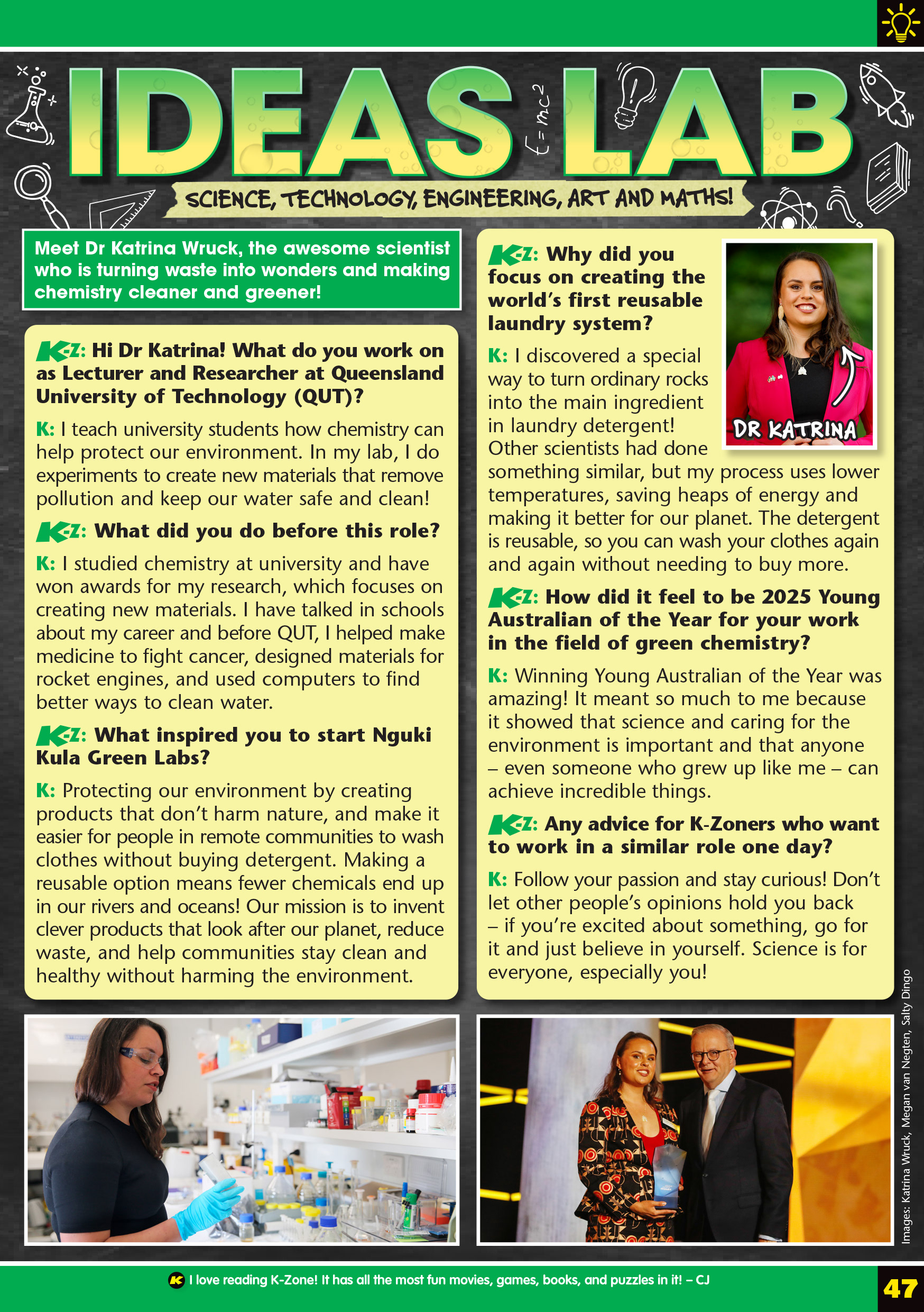
Left: old design. Right: new design.
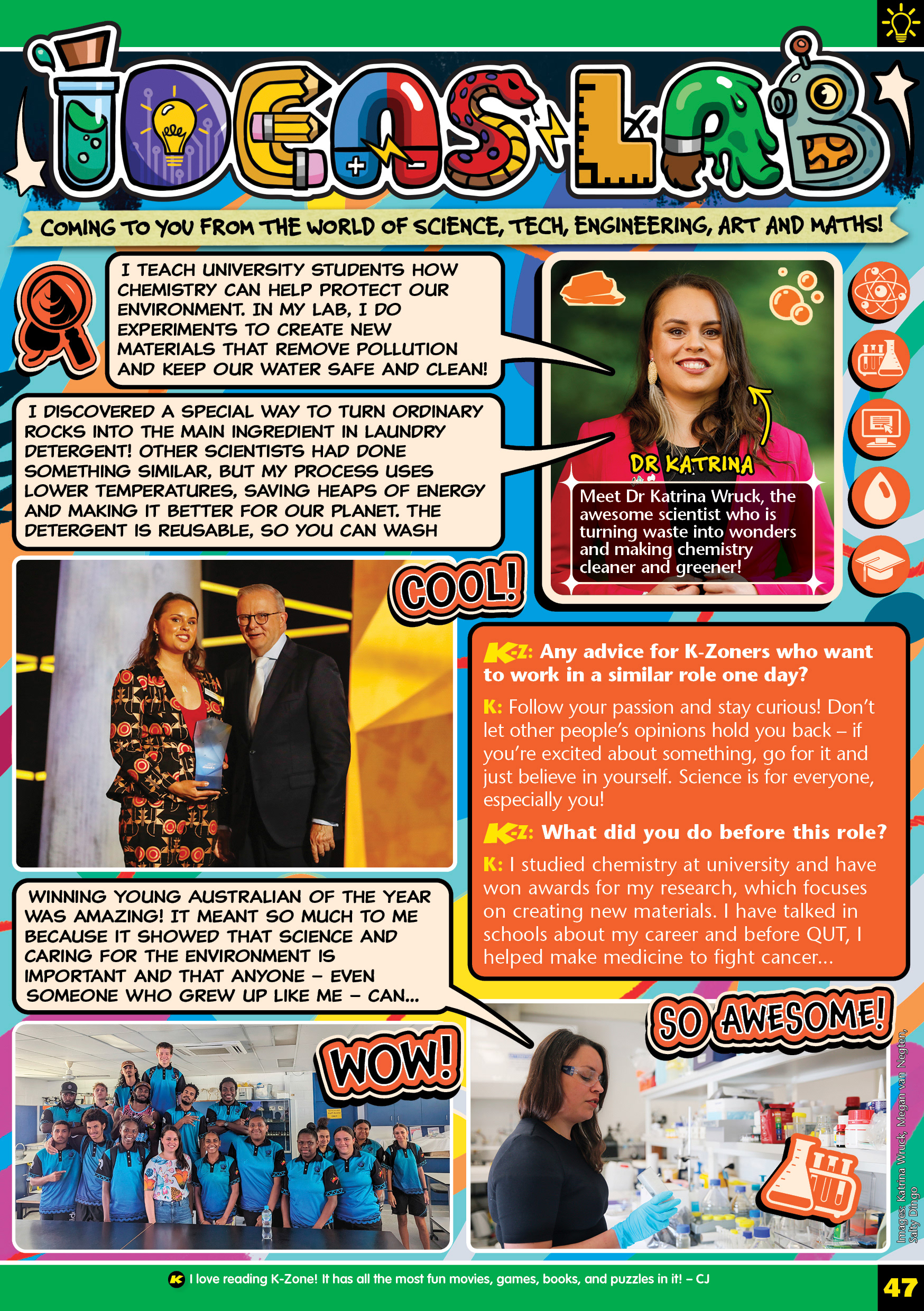

Final page in two different magazine issues.