Beyond design execution, I actively look for ways to push visual storytelling further, experimenting with bold colour palettes, playful typography, and inventive page compositions that reflect the energy of K-Zone’s audience. I thrive on turning complex ideas into simple, visually exciting content that feels approachable and fun. Whether it’s brainstorming with the team to develop a fresh editorial concept, refining artwork to meet tight deadlines, or ensuring every page feels cohesive within the issue, I approach each project with a mix of curiosity, adaptability, and enthusiasm for kids’ media.
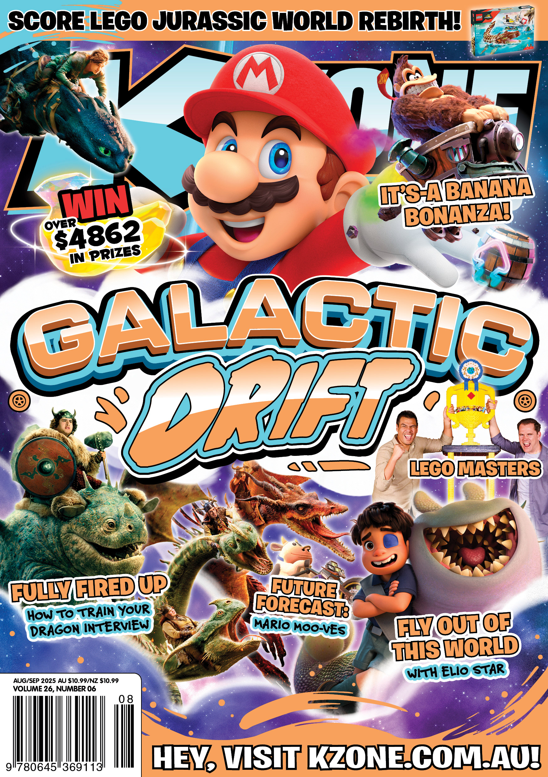
Covers created for the 'Aug/Sep' & 'October' issues of K-Zone.
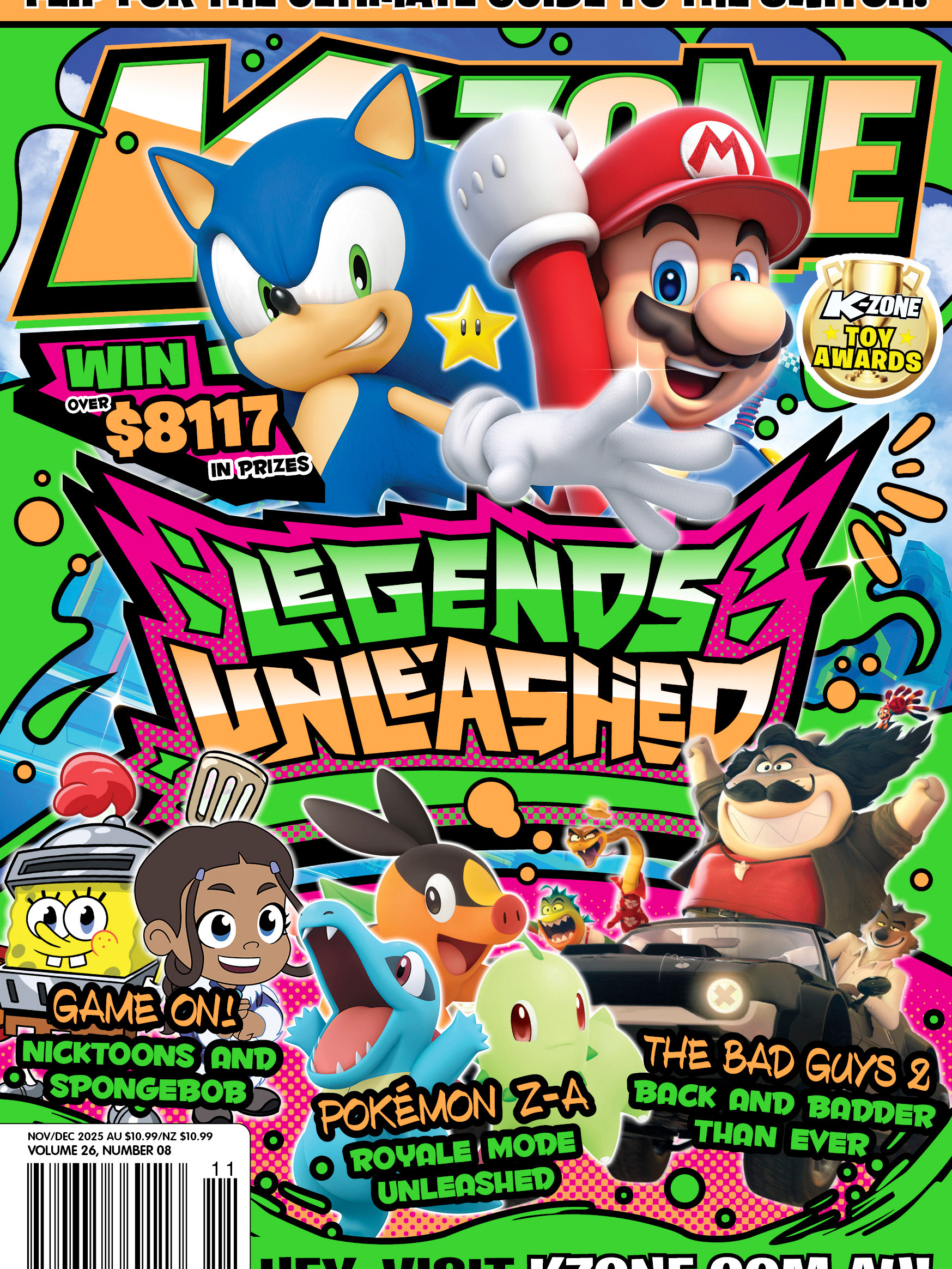
Building on the same design philosophy as the previous two covers, I focused on enhancing compositional impact and overall cohesion by tying each issue strongly to its theme. The Aug/Sep issue (left) was guided by two distinct visual pillars, “Galactic” and “Drift.” My challenge was to merge these concepts in a way that felt seamless, allowing them to complement each other while creating a result that neither could achieve on its own.
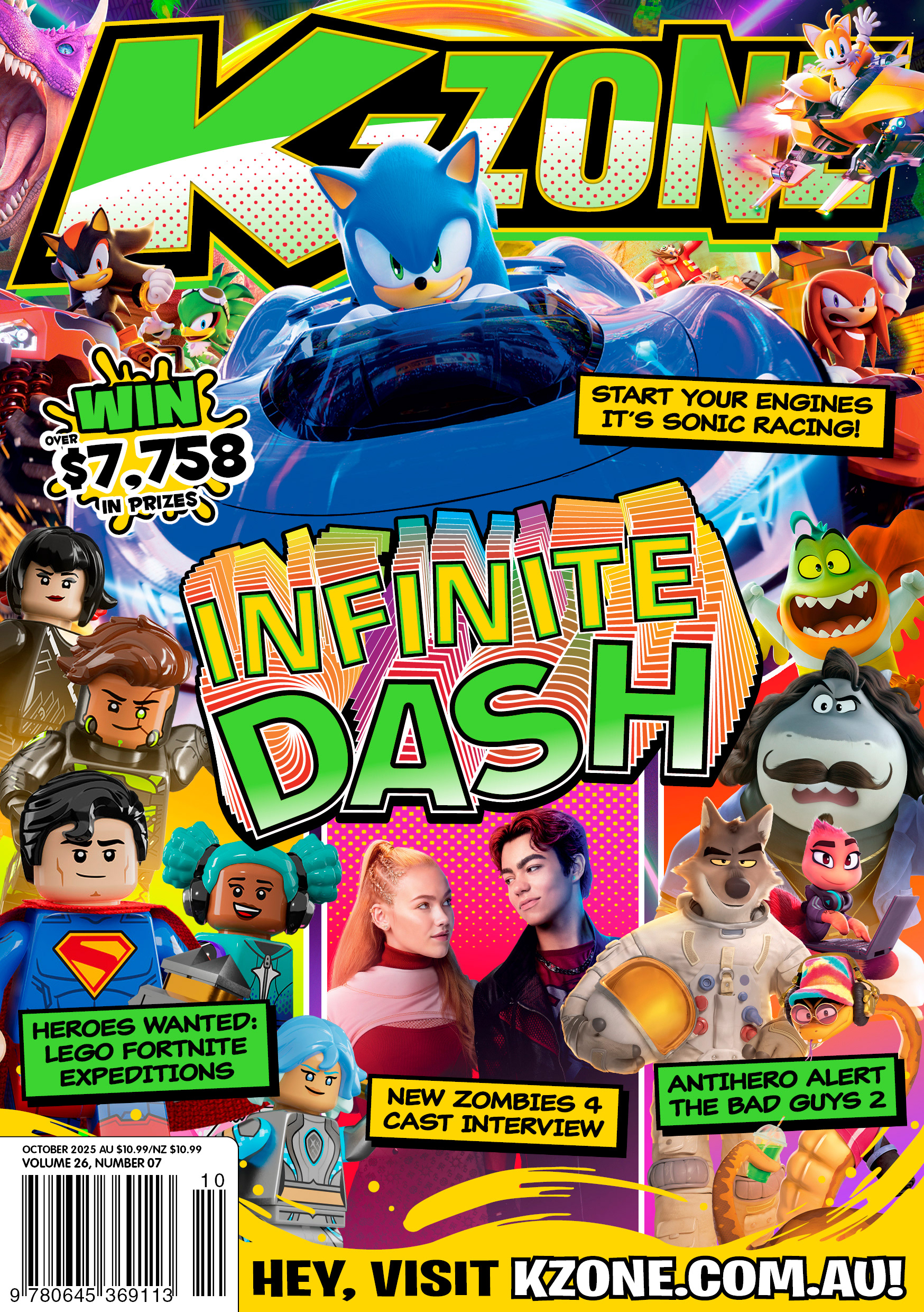
The October issue (right) followed a similar approach, but this time I leaned into colour and gradients as a metaphor for “infinity.” The aim was to evoke the feeling of stepping into a vibrant arcade, bursting with light, energy, and curiosity. A visual experience that feels hyperpop, fun, and irresistibly engaging for young readers.
This is another example where both graphic design and illustration skillsets were crucial in executing the final outcome.
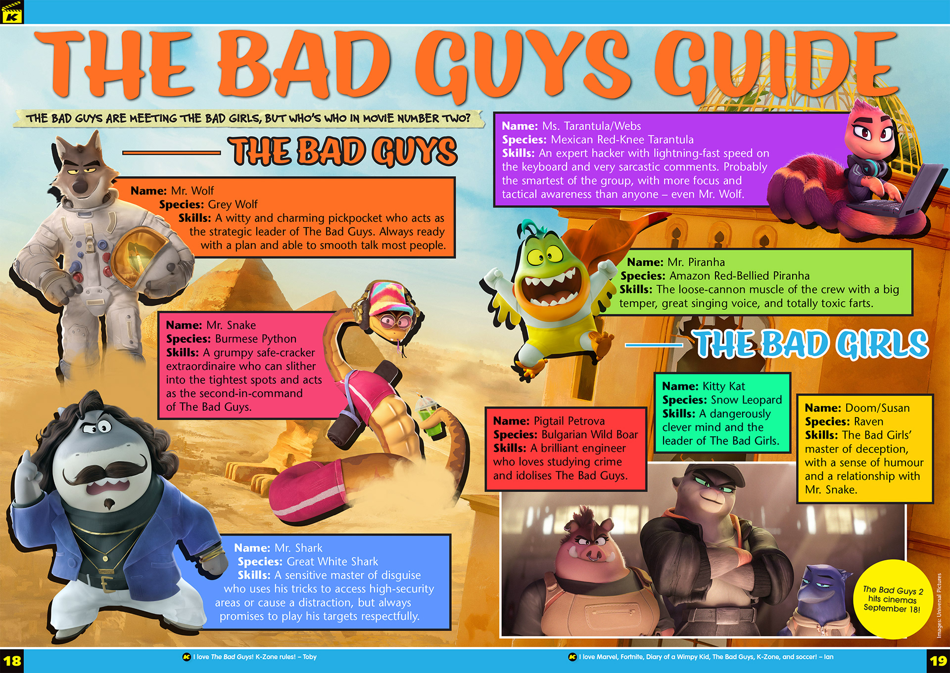
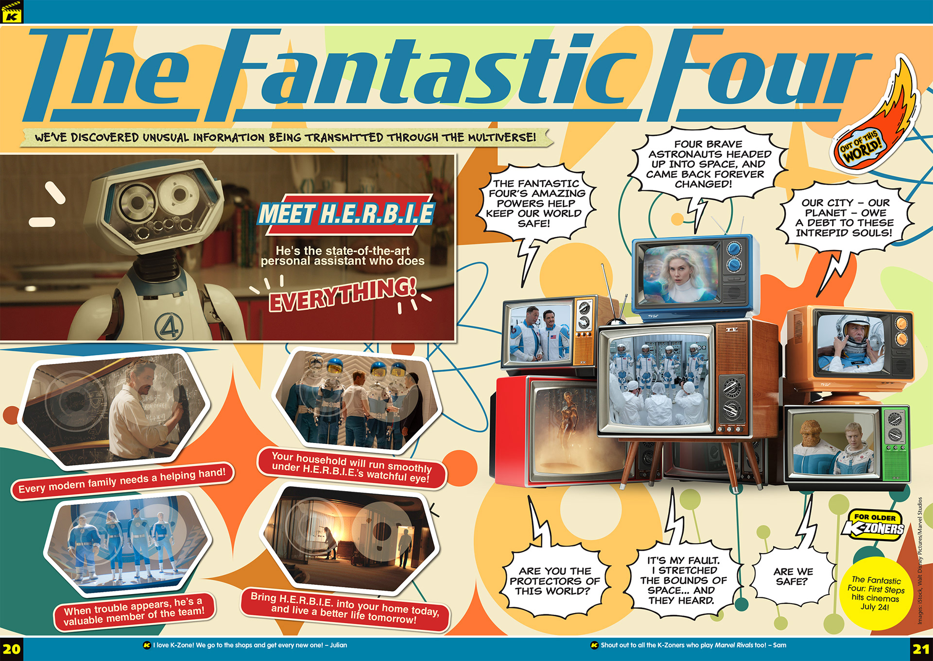
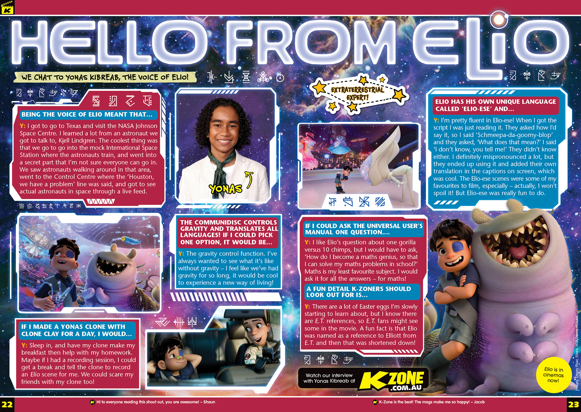
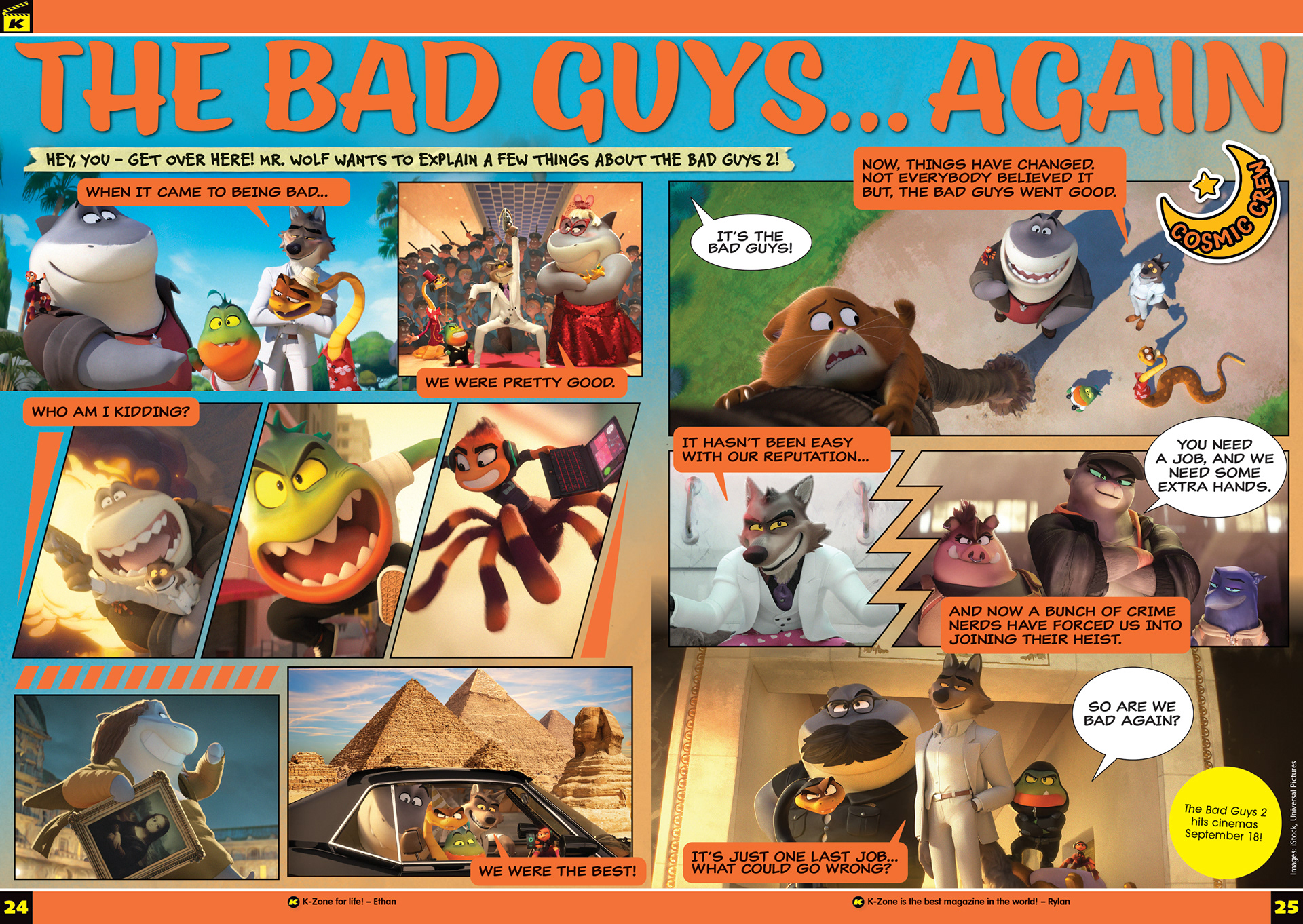
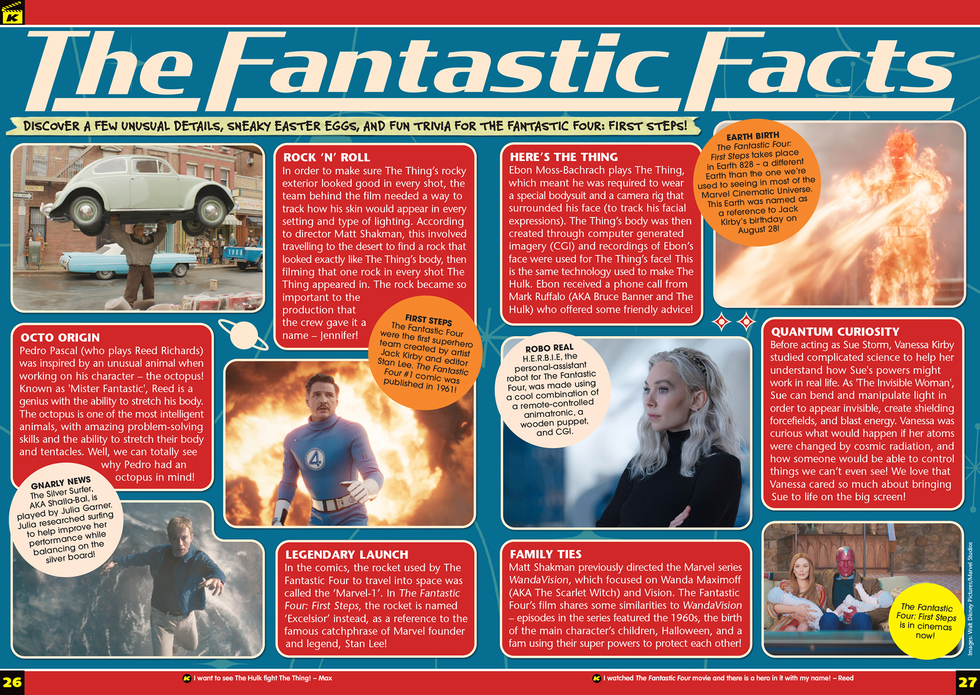
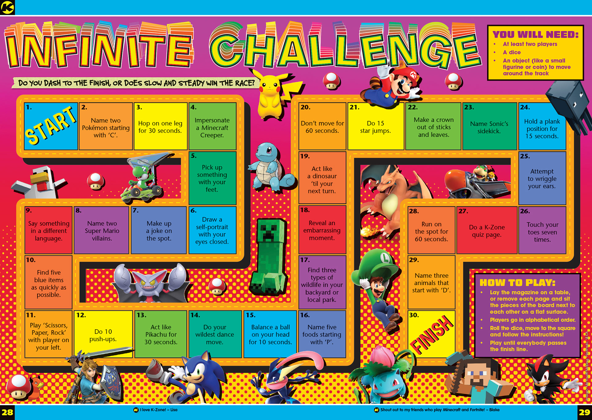
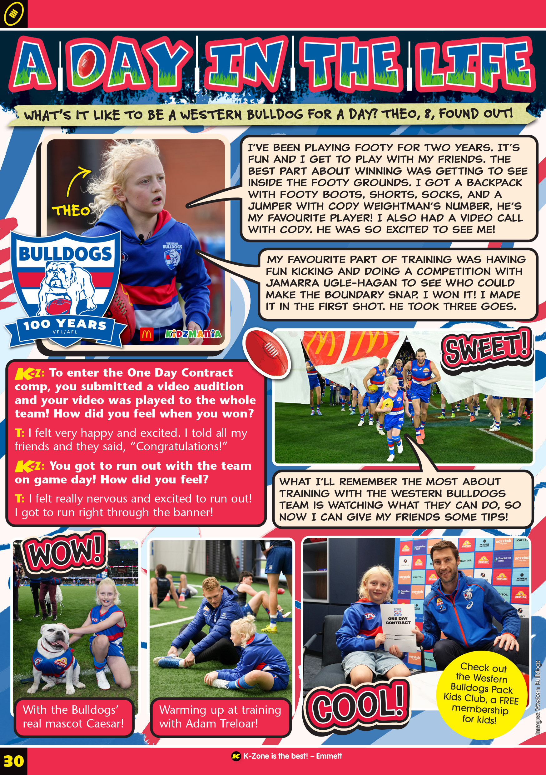
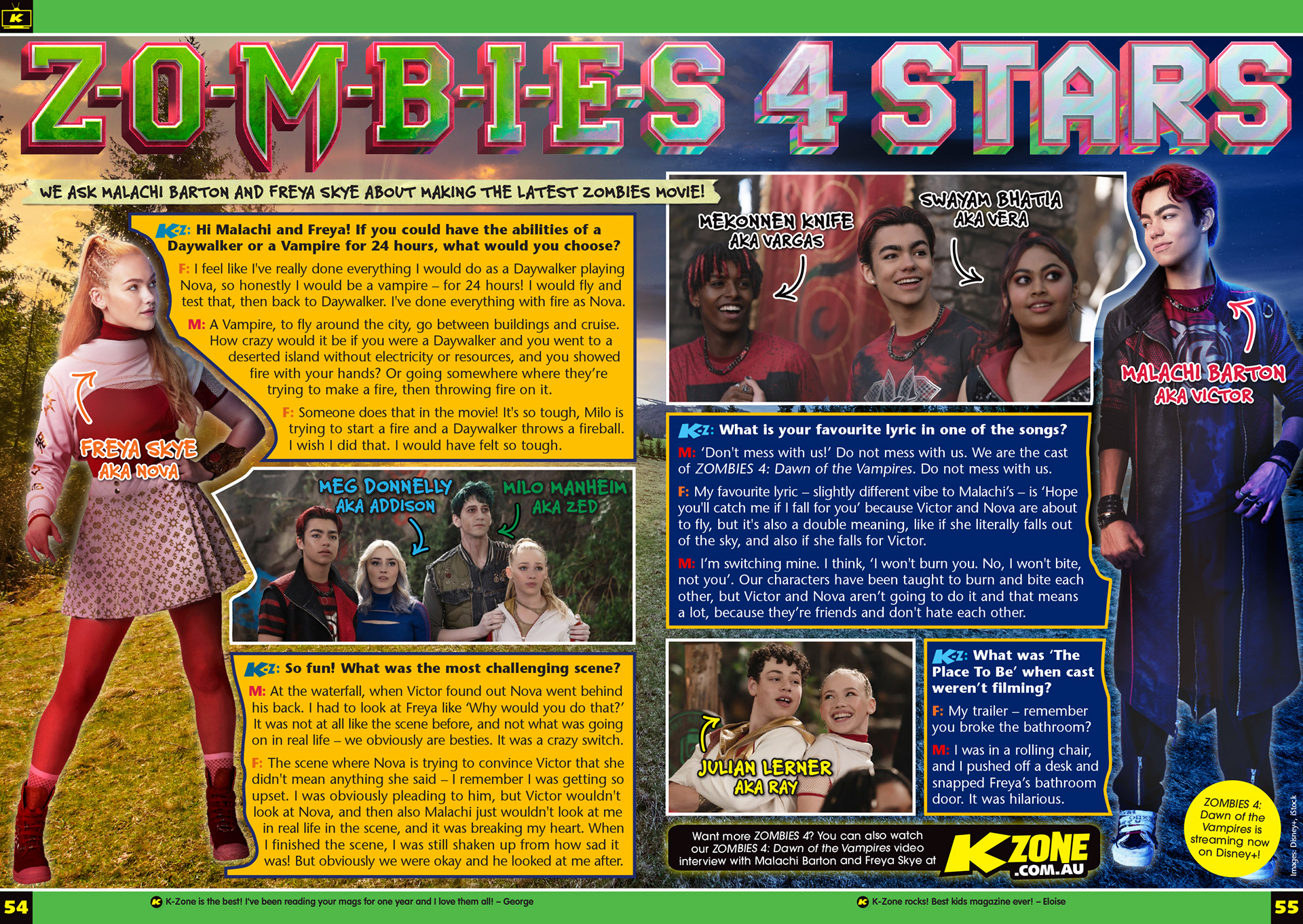
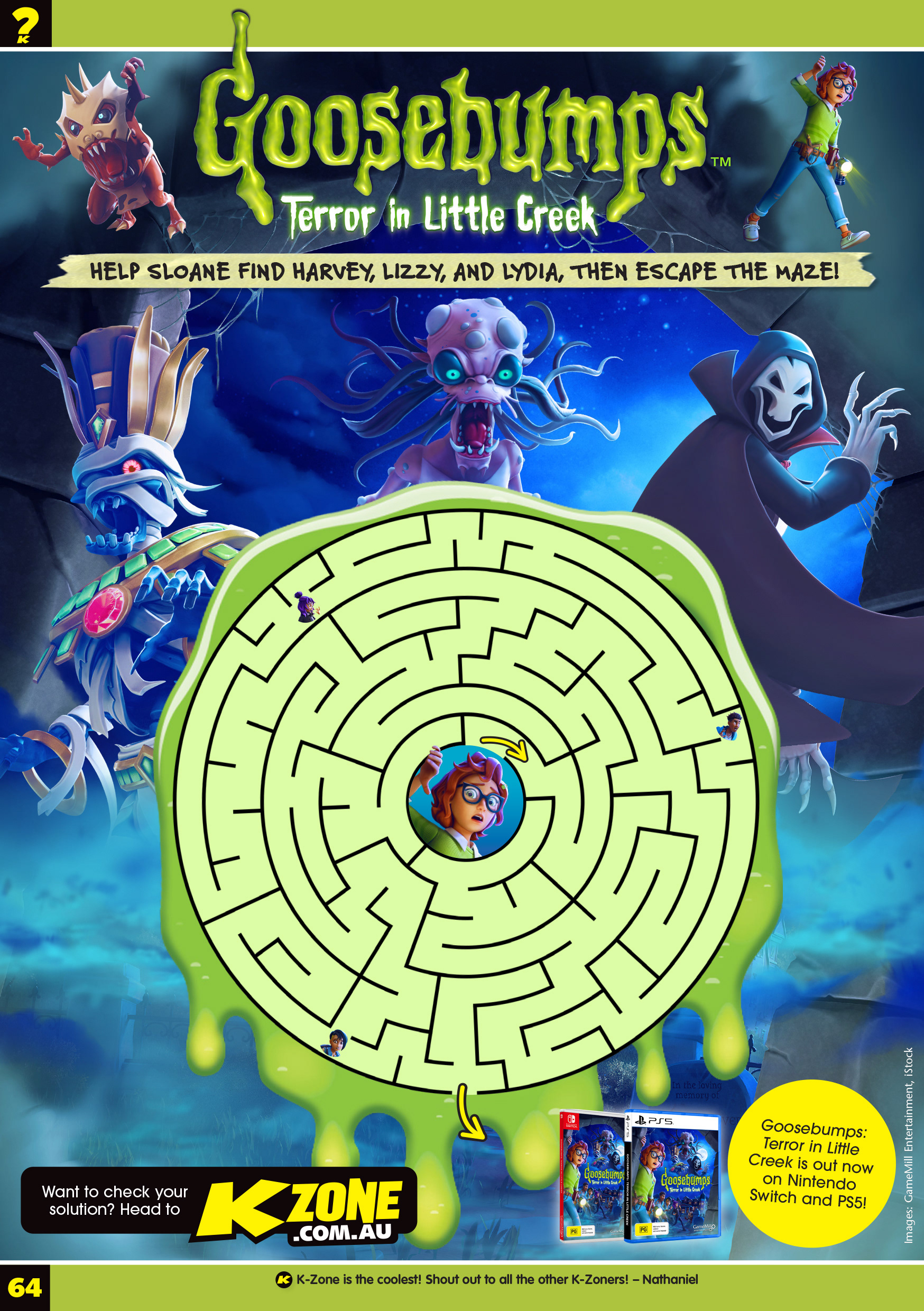
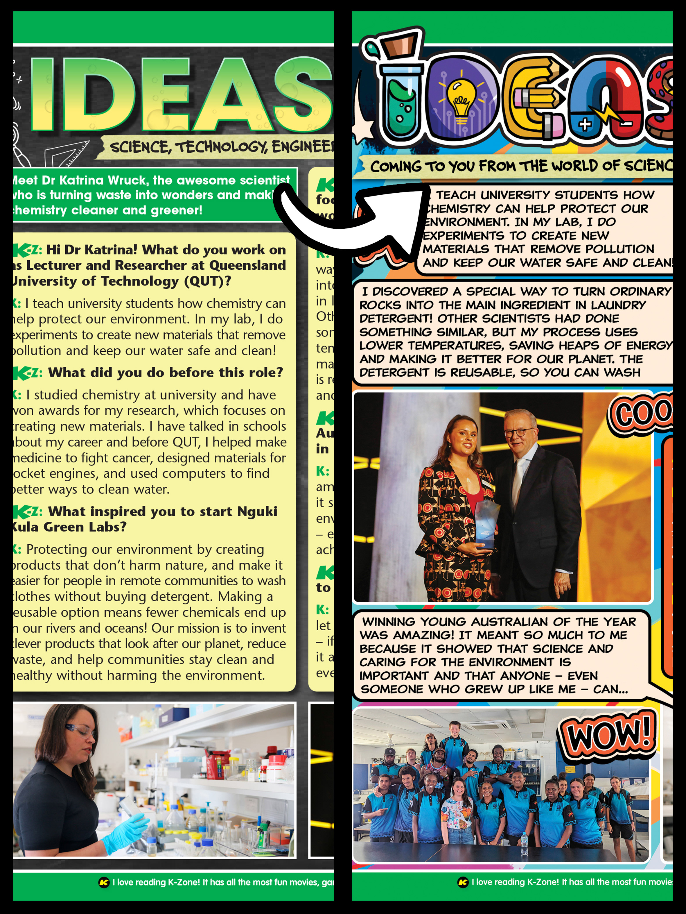
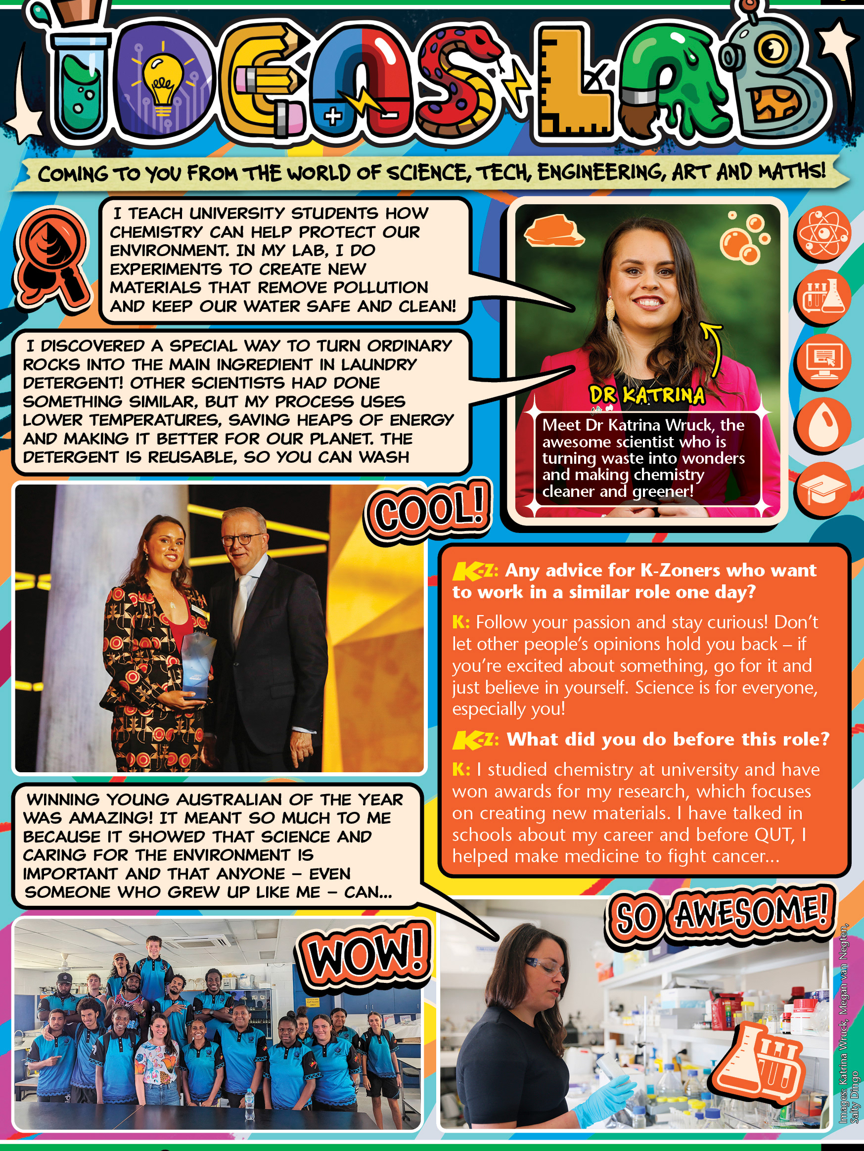
Below: an assortment of pages from both magazine issues, ranging from upcoming movies and TV shows to games and activities. The 'IDEAS LAB' page is a redesign of a template page. This new direction focuses on fun and excitement, where the header is hand-drawn and a key part of establishing the tone.